
Bullish Percent Indices
Bullish percent indices are market breadth indicators that measure the percentage of stocks within a specific index, sector, or market that are exhibiting bullish patterns on their point & figure charts. Divergences on this indicator have historically signaled good times to buy or sell constituent holdings, making bullish percent indices valuable tools for traders. In order to learn how to use them effectively, this article outlines how they are created and how to interpret them.
Point & Figure Charting
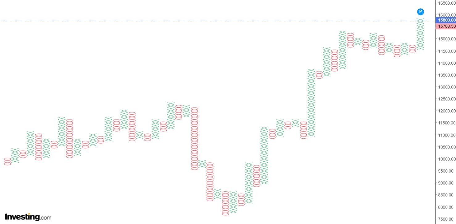
Point and figure (P&F) charting is a time-independent way of visualizing price trends. It involves plotting columns (figures) of X or O symbols (points), where X columns represent upward price trends, and O columns represent downward price trends.
 P&F chart example
In the above example, it can be observed that x-axis dates that would normally be present on stock charts are noticeably absent. This is because P&F charts focus only on price action, and not on time.
Points are plotted based on the following rules:
- A new point is plotted in the current column when price moves in the direction of the current trend by one box size, where a box size is a constant price interval. For example, if price is currently trending upwards and the box size is $1, a new X point would be plotted if price were to increase by $1 from the current column high.
- A new column is started when price moves in the opposite direction of the current trend by the reversal amount of three box sizes. For example. if price is currently trending upwards and the box size is $1, a new column of three O points would be plotted if price were to decrease by $3 from the previous column high.
For each stock, the box size that is selected depends to the stock’s trading price. Here is a table of box sizes that have traditionally been used:
| Stock Price Range | Box Size |
|---|---|
| Under $0.25 | $0.0625 |
| $0.25 to $1.00 | $0.125 |
| $1.00 to $5.00 | $0.25 |
| $5.00 to $20.00 | $0.50 |
| $20.00 to $100 | $1.00 |
| $100 to $200 | $2.00 |
| $200 to $500 | $4.00 |
| $500 to $1,000 | $5.00 |
| $1,000 to $25,000 | $50.00 |
| $25,000 and up | $500.00 |
Here is an example of how to construct a P&F chart using the rules outlined above (assume a box size of $1 and reversal amount of $3):
Given historical price action of $23, $24, $26, $25, $26, $23, and $22, we can construct the following P&F chart.
| Price | Column 1 | Column 2 |
|---|---|---|
| $26 | X | |
| $25 | X | O |
| $24 | X | O |
| $23 | O | |
| $22 | O |
First, price increased from $23 to $26, which is three box sizes and means we need to plot three X points in the first column. Then, price decreased by $1 to $25, but, since this is less than the required reversal amount of three box sizes, no point is plotted. Next, price increased by one box size to $26, but, since this is not greater than the highest price for this column, no point is plotted. Finally, price dropped to $23, then $22, which causes a new column of three O points to be plotted because the reversal amount of $3 was met, plus an additional O point for the drop to $22.
Bullish Percent Index Construction
To construct a Bullish Percent Index (BPI), we must first define the group of stocks we are interested in studying. In most cases, this will be an index or ETF that already exists. For example, if we are interested in the technology sector, we can construct a BPI for XLK (Technology Select Sector SPDR Fund), which is a popular ETF for the US technology sector.
Next, a P&F chart for each constituent stock is programmatically generated. For the sake of consistency, historical daily closing prices for each stock are used, and intraday movements are ignored. For example, say a constituent stock had a previous closing price of $10 and has a box size of $1. If the stock experiences massive intraday price swings of $5 but closes at $10 again, no new P&F point will be plotted because intraday movements are not considered.
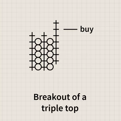
Having obtained every P&F chart for the day, the number of charts exhibiting P&F technical buy signals is then programmatically counted. A stock must exhibit one of three buy signals to be included in the BPI count: double top breakout, triple top breakout, or ascending triple top breakout.
A double top or triple top breakout involves an X point that exceeds the high of the previous one or two X columns.
An ascending triple top breakout is similar, but more specifically refers to a breakout from an ascending triangle pattern.

More complex bullish patterns, such as bullish catapults, are not included because they are less standardized for automated, large-scale calculations across hundreds of stocks.
By dividing the count of bullish stocks by the total number of stocks in the index, a percentage is obtained. Plotting these daily historical percentages produces the BPI indicator:
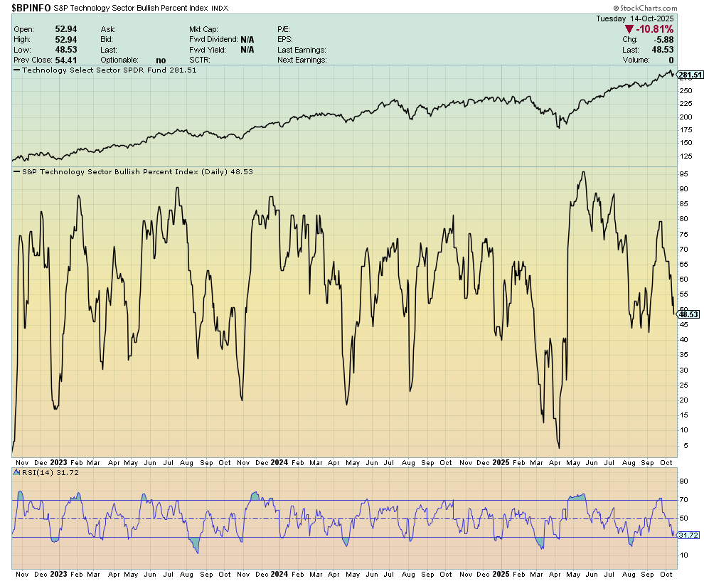
Note: This chart was made on stockcharts.com, where anyone can recreate it for free.
Momentum And Strategy
Though a BPI alone can provide useful market breadth information, comparing it to its RSI allows more insight to be gleaned.
Firstly, oversold (RSI < 30) and overbought (RSI > 70) momentum readings are still applicable (read more here). Secondly, and more importantly, divergences between a BPI and its RSI have historically signaled opportune moments to buy or sell.
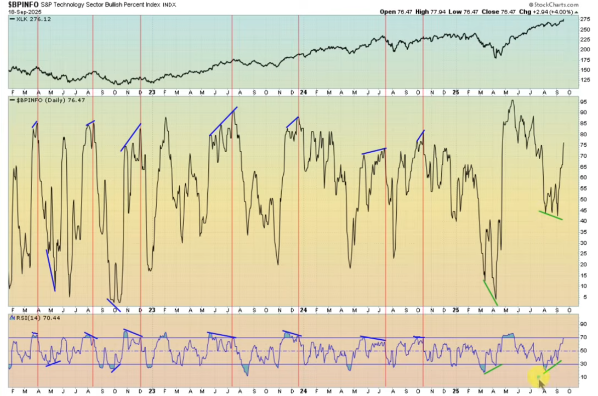
In the above chart, both bullish and bearish divergences have been annotated. It can be observed that, in the case of the BPI for XLK, bearish divergences have historically coincided with local market tops (highlighted using vertical red lines). Conversely, bullish divergences have historically signaled good times to buy, with RSI usually shooting back up into overbought territory soon after.
Let’s take a look at the BPI for a broader group of stocks in order to confirm the consistency of the divergence signals observed above. Here is the BPI for SPX:
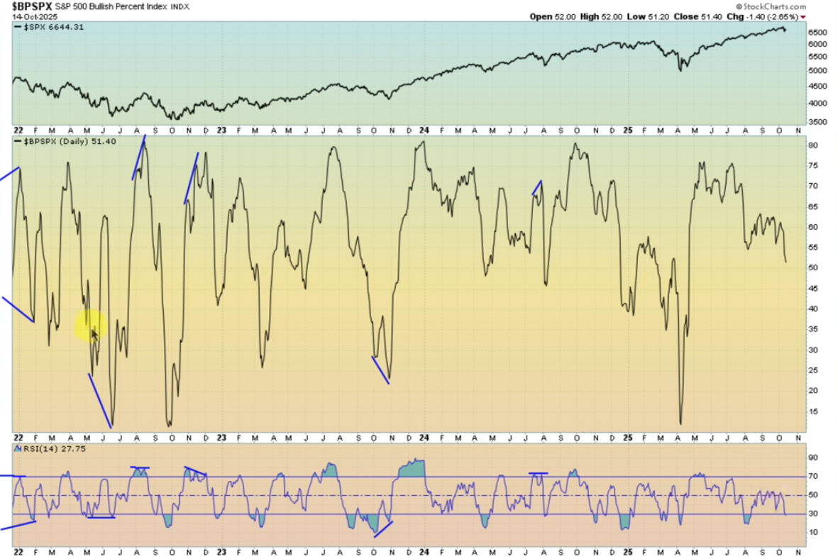
Again, we see similar divergences playing out in the same way. Though there are fewer bullish divergences on this chart, we can observe that the index consistently runs up into overbought territory soon after they do form.
Based on their solid track record, the formation of BPI divergences represent excellent opportunities to enter asymmetric trades. After a bullish divergence has formed, opening a position in the target ETF (or even better, in individual constituent stocks that are setting up well) has historically been likely to result in gains. Accordingly, this indicator is a valuable addition into any active trader’s toolbox.
Sources
- https://blog.elearnmarkets.com/trade-using-point-and-figure-chart/
- https://www.investopedia.com/articles/technical/03/081303.asp
- https://chartschool.stockcharts.com/table-of-contents/chart-analysis/point-and-figure-charts/point-and-figure-basics/introduction-to-point-and-figure-charts
- https://chartschool.stockcharts.com/table-of-contents/chart-analysis/point-and-figure-charts/classic-patterns
- https://stockcharts.com/sc3/ui/?s=%24BPINFO
- https://youtu.be/q9jJzJpVdic?si=Jq-8A6W0yaudavG7
- https://youtu.be/8Y6k_leHGNE?si=Ebwiz—6L5C7dEGY