
IV Term Structure
Implied volatility (IV) term structure relates the IV of options to their time to expiration. By analyzing this relationship, traders can gain insight into how the market is pricing risk across various time horizons. When the difference between short-term and longer-term risk expectations becomes too great, it can serve as an oversold or overbought signal because it tends to indicate a mispricing of short-term risk. By keeping an eye on when this occurs, traders can get ahead of potential corrections before they happen. Let’s learn how to do exactly that.
Graphing
IV term structure is visualized as a curve. It is constructed by plotting IV versus time to expiration for all options of a single underlying instrument. For example, here is the IV term structure for $SPY (as of August 2025):
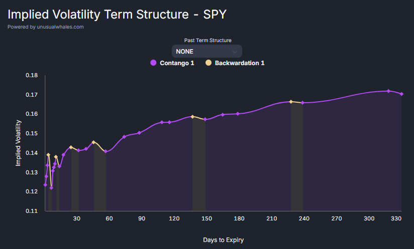
What do contango and backwardation mean? Periods of contango correspond to a positive slope in the curve and represent where short-term IV is less than longer-term IV. Conversely, periods of backwardation have a negative slope on the curve and represent where short-term IV is greater than longer-term IV.
Defining Risk
IV can be considered a metric for the market’s expectations of risk. This is because IV represents how large the market thinks potential price swings will be.
A higher IV corresponds to higher risk and greater uncertainty because it means that the market is expecting larger price swings. Conversely, a lower IV corresponds to lower risk and less uncertainty because it means that the market is expecting smaller price swings.
If IV in the short-term is drastically different than IV in the longer-term, it usually means that investors are mispricing short-term risk. In the case of steep contango, it means that investors have become complacent about risks on the horizon. In the case of steep backwardation, it means that investors have become overly cautious despite there being little risk on the horizon. By identifying when these mispricings occur, traders can get on the right side of risk before the rest of the market.
Back Versus Front Month Volatility
To create a signal that triggers when the IV difference becomes too large, rather than needing to look at the entire curve, it is sufficient to look at the relative risk of a single short-term (front month) expiration compared to a single longer-term (back month) expiration.
For example, a time to expiration of 30 days (tracked by $VIX for the S&P 500) can be compared to a time to expiration of 3 months (tracked by $VIX3M, formerly $VXV, for the S&P 500). The history of the ratio between these two can be graphed:

Note: The code to generate this chart is open-souce and can be found at https://github.com/HKanwal/back-vs-front-month-volatility
The danger zone is any reading above 1.2. When the ratio enters this zone, it can serve as an overbought signal due to an underpricing of short-term risk. As risks inevitably materialize, such mispositioning tends to excarbate downward moves and cause significant pullbacks.
On the other hand, when the ratio falls under 1.0, it can serve as an oversold signal due to the overpricing of short-term risk. This tends to correspond with periods of market panic. As risks fail to materialize and fears are assauged, prices tend to recover.
Backtesting
To build confidence that these signals have predictive power, we can perform a basic backtest:

Highlighted in green are periods where the ratio was below 1.0, indicating when investors were overly cautious. Highlighted in red are periods where the ratio was above 1.2, indicating when investors were overly optimistic.
Upon visual inspection, we can see that green periods do indeed tend to coincide with local bottoms, and that red periods do indeed tend to coincide with local tops. This gives us evidence that the produced signals do indeed have value.
Note: It is always important to consult multiple indicators. Readings that are in or out of confluence can serve to enhance or diminish signal strength.