
US Treasuries (UST) Explained
Ever since Trump’s “Liberation Day” rally, rising long-term treasury yields have been a hot topic in financial news media. In order to understand the implications of high yields, and to evaluate for ourselves whether the concern is warranted, a solid foundational base of knowledge is required. Though the subject is broad, here’s a primer on US treasuries and the bond market.
The Name’s Bond
What are treasuries? Treasuries refer to financial instruments (securities) representing debt issued by the US Department of the Treasury, aka the US Treasury (hence the name treasuries). Each issued treasury has an associated repayment period, aka maturity, which is the length of time after issuance over which the US goverment must repay the lender. These maturities can range from as short as 4 weeks to as long as 30 years.
Even if the borrower is a government, investors are not in the business of lending money for free! Instead, the US government must pay interest to its treasury holders—the distribution frequency depending on the type of treasury held. The US Treasury has various marketable offerings available for auction. Here is a brief summary of all of them:
Treasury bills (T-bills) are short-term securities with maturities of 1 year of less, the standard maturities being 4, 8, 13, 17, 26, or 52 weeks. Given their brevity, T-bills are structured as zero-coupon investments, meaning holders do not recieve periodic interest payments. Instead, T-bills are sold at a discount to their face value, with the difference between a T-bill’s face value and discount price constituting its interest. For example, a T-bill with a face value of $100 (meaning $100 would be paid out at maturity) may be auctioned at a discount price of $95, with the $5 difference constituting its interest.
Treasury notes (T-notes) are medium-term securities with maturities ranging from 2 years to 10 years, the standard maturities being 2, 3, 5, 7, or 10 years. Based on their fixed coupon rates, which are decided at the time of auction, T-notes pay out periodic coupons (interest payments) semi-annually. For example, a 2-year T-note with a face value of $100 auctioned at a 4% annual coupon rate (auction rate) would pay out $2 semi-annually four times, resulting in $8 of interest at maturity.
Treasury bonds (T-bonds) are long-term securities with maturities of either 20 or 30 years. Like T-notes, T-bonds have fixed coupon-rates and pay out periodic coupons semi-annually.
Treasury Inflation-Protected Securities (TIPS) are medium to long-term securities with maturities of 5, 10, or 30 years. To provide investors with protection against inflation, TIPS feature monthly adjustments to the principal amount based on changes in the CPI (Consumer Price Index). If the CPI were to go up, TIPS holders would see a proportional rise in their principal amount, and vice-versa if the CPI were to go down. The resultant semi-annual coupons—which use the inflation-adjusted principal—should therefore provide a consistent real return at the fixed coupon rate. Additionally, to protect against a scenario in which the inflation-adjusted principal becomes less than the original face value at maturity, TIPS are redeemed at whichever is higher.
Floating Rate Notes (FRNs) are medium-term securities with 2-year maturities. Like the name implies, they have a variable interest rate that updates weekly. New rates are calculated as the most recent 13-week T-bill auction rate plus a fixed spread which is decided at the time of auction. Unlike other treasuries, coupons are distrubuted quarterly (every 3 months).
Note: By definition, all treasuries are technically bonds because they are fixed-income debt instruments. However, since the term “bond” can also be used to refer specifically to T-bonds, its disambiguation depends on context. For example, news articles mentioning “bond markets” are most likely referring to markets for treasuries in general, not just for T-bonds.
What’s The Deal With Yield?
The treasuries covered so far are marketable, meaning they can be resold on secondary markets after auction. This provides investors with the flexibility to liquidate prior to maturity, though they will be beholden to the market.
When discussing the value of treasuries, interest rates, aka yields, are cited more frequently than prices. Why? Because yields allow for the easier comparison of returns between treasuries of differing maturities, face values, and/or coupon rates. To illustrate, a 2-year treasury and a 10-year treasury, despite having vastly different prices, could have the same yields, and so the same returns, which investors consider to be far more important.

The above bond pricing formula defines the relationship between a treasury’s price and its yield, where Par Value refers to face value, n is the number of periods remaining until maturity, and YTM (Yield To Maturity) is the annualized yield—assuming semi-annual coupons. While the formula may seem daunting at first, learning about the time value money will make it simpler to understand.
TVM (Time Value of Money) is the financial concept that money received in the present is more valuable than money received in the future due to factors like inflation, opportunity cost, interest, and uncertainty. Discounting, the opposite of compounding, is the process of converting a future value (FV) into a present value (PV), accounting for TVM. The discounting formula is:
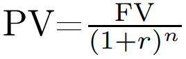
Here, r is the discount rate and n is the number of time periods. Does the right-hand side of the equation seem familiar? If you compare it to the bond pricing formula, you will find that a treasury’s price is simply a sum of discounted future values. Specifically, it’s the sum of discounted future coupon payments plus the eventual principal repayment. The constant discount rate applied to all of these future cash flows is YTM / 2.
Having understood the formula, let’s now analyze its characteristics. Firstly, it is clear that the relationship between price and yield is inversely proportional. This means that when yields are up, the treasury market is actually down, and vice versa. This inverse relationship can oftentimes be counterintuitive for market onlookers, but it explains why headlines like “bond market collapse” correspond to high yields.
Secondly, we can see that it is impossible to isolate for YTM in the bond pricing formula. Instead, YTM must be calculated via numerical methods using computer assistance. Alternatively, an approximation can be obtained directly using a simpler formula:
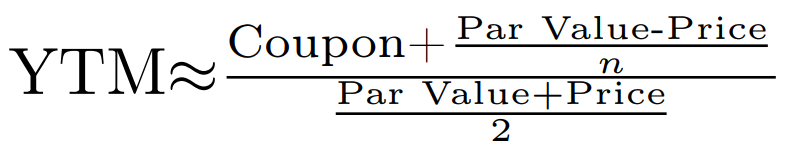
While the above approximation may be convenient in the absence of computational tools, due to its inaccuracy, which gets worse for longer maturities and for larger price deviations from par, the original formula should be preferred.
Note: Besides YTM, there are various other types of yield, including current yield, cost yield, and nominal yield. YTM, however, is the most commonly used and referred to.
Zero Curve
Though YTM is the standard metric when discussing yields, bond prices calculated using YTM are approximations made under the assumption that the discount rate for each future cash flow is constant. In reality, rates for different times to future cash flow vary. For example, due to a variety of market and economic factors, the market might offer a 2% discount rate (2% per year) for a period of 2 years, but a 3% discount rate (3% per year) if the period is 4 years. For this reason, a more accurate bond pricing model involves applying a separate discount rate to each future cash flow:
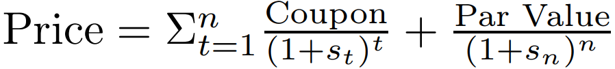
Here, each rate is denoted by s, standing for spot rate. A spot rate is the current discount rate the market is willing to pay for the time till the corresponding future cash flow. Continuing from our previous example, our new model would apply a spot rate of 2% for a coupon payment scheduled 2 years in the future, and a spot rate of 3% for a coupon payment scheduled 4 years in the future.
How can spot rates be obtained? Fortunately, there exists a type of financial instrument representing exactly what we need. Treasury STRIPS bonds are created by separating the individual coupon and principal payments of a treasury into their own, distinct securities. Since each STRIPS represents a single future cash flow that is paid out at maturity, and does not pay coupons, its market rate is the spot rate for that maturity. By collecting market data for these zero-coupon securities and graphing their rates, we get the spot rate curve, or zero curve:
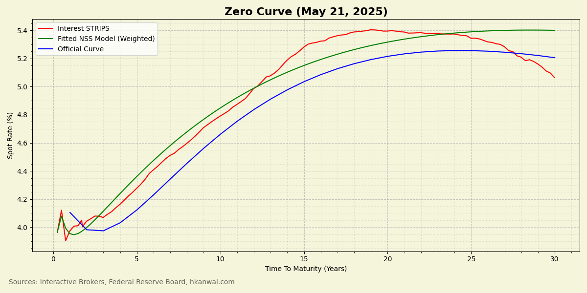
There are three zero curves graphed above. The first curve is raw STRIPS spot rate data collected through a broker. The second curve is a continuous mathematical model fitted through the STRIPS data. The model has been weighted in favor of shorter maturities to reflect their higher liquidity and more accurate pricing. The third curve is the one provided by the Federal Reserve. It incorporates more sophisticated methodologies and is likely to be the most accurate.
Having constructed the zero curve, which represents pure TVM, the more precise version of the bond pricing formula can be easily used by plugging in the corresponding spot rate for each future cash flow.
Forward Curve And Federal Reserve
The forward curve is a graphical representation of the market’s expectations for future short-term rates. It can be used to gauge how likely the market thinks it is for the central bank, the Federal Reserve (Fed), to raise or lower its rates.
Given it’s ability to provide useful economic insights, let’s learn how to construct the forward curve. Derived from the zero curve, the forward curve plots forward rates calculated according to the following formula:
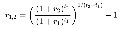
A forward rate is an expected future interest rate for a specific future period. In the formula, t1 is the time until the start of the future period (in years), and t2 is the time until the end of the future period. The length of the future period, usually 1 year, is (t2 - t1) and is kept constant for each calculation. r1 is the spot rate at t1—the value of the zero curve when time to maturity is equal to t1—and r2 is the spot rate at t2. The result, r1,2, is the forward rate for the period from t1 to t2.
To produce the forward curve, the forward rate formula is applied continuously across the zero curve. Then, the resulting forward rates are plotted against t1, as shown below:
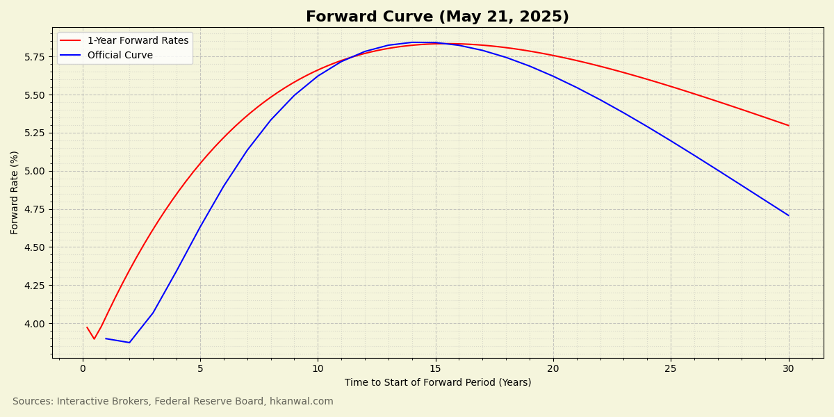
According to the shape of the forward curve, the market does not expect many more rate cuts during this cutting cycle, which it expects to last another 1 to 3 years. Afterwards, in the medium term, the market is expecting 1-year rates to move up over the next 10-15 years. This goes against the current adminstration’s vocal demands for rate cuts, both in terms of the speed at which they should fall, and the level they should be dropped to. So, what are the reasons for this shape?
The Federal Reserve has a dual mandate: to promote maximum employment and stable prices. These two goals guide the Fed’s decisions regarding rate changes. Consequently, economic strength and inflation expectations are the two most influential factors that determine the forward curve’s shape.
To combat rising unemployment, the Fed is likely to lower rates to stimulate economic activity. On the flip side of the coin, to combat high inflation, the Fed is likely to raise rates to cool economic activity. Therefore, the hump in the forward curve suggests that the market expects high inflation to re-emerge in the medium term, potentially due to sticky inflation or tariff effects.
What does the shape suggest about unemployment expectations? Either it suggests continued US economic strength to enable and withstand the rate hikes, or it suggests that, in the case of simultaneous high inflation and rising unemployment (stagflation), the Fed will prioritize fighting inflation at the expense of economic activity.
Yield Curve Shifts
The curves presented thus far were generated using data collected on May 21, 2025, representing a single-day market snapshot. If the data were to have been collected on a different day, the curves would have looked different, because spot rates, and yields in general, change over time. The ways in which yield curves can change are called yield curve shifts. The four most common shifts are: bear steepeners, bear flatteners, bull steepeners, and bull flatteners. Here is what they look like:
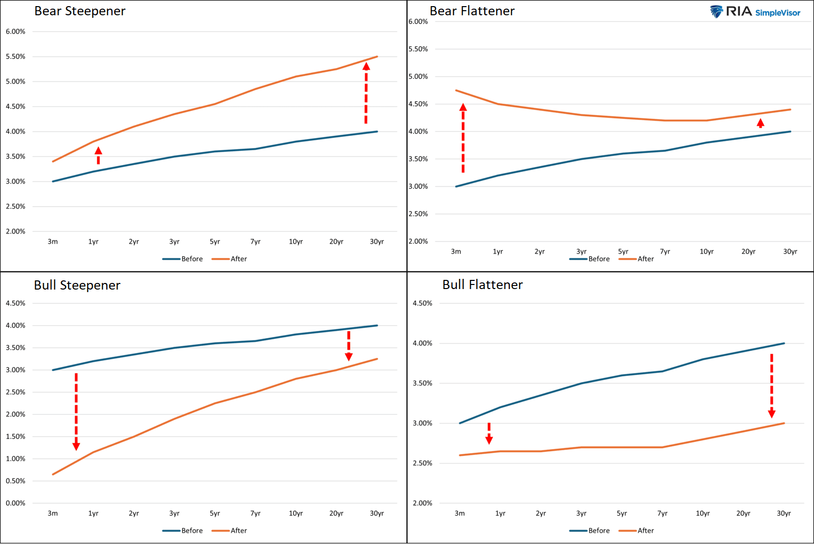
The names are self-explanatory. The two bearish shifts correspond to an overall increase in yields, which is bearish for prices because yield and price are inversely proportional. Likewise, the two bullish shifts correpond to an overall decrease in yields. The steepeners correspond to a steepening of the curve’s slope, and, likewise, the flatteners correspond to a flattening of the curve’s slope.
With this nomenclature in our vocabulary, we will be able to discuss yield curves in more depth.
Components Of Yield
In order to demystify yield, let’s think of it as a sum of multiple components that can each be analyzed individually.
First, TVM, which was previously discussed, sets the baseline yield of a treasury. This baseline yield is the short-term, risk-free rate that can be earned on a 3-month T-bill, free from default risk and having minimal interest rate risk. Absent other premiums, the yield of a treasury of any maturity would just be that of the 3-month T-bill rolled over and over for its entire lifetime, which is what the zero curve visualizes. To get investors to take the risk of holding longer maturities, they must be paid a premium.
What is interest rate risk? It is the risk that the Fed will increase rates in the future, thereby making the existing treasuries held by investors less valuable. To compensate for this risk, there is a term premium that is added into yield. Duration is a measure of price sensitivity to interest rate changes, and, therefore, is a measure of interest rate risk. Since, due to the effects of compound interest, longer maturity treasuries have higher duration (higher interest rate risk), term premium increases as time to maturity increases.
Term premium tends to be inversely proportional to the risk-free rate. This is because, when the risk-free rate is low, it is more likely to increase than to decrease, which causes term premium to be high. Likewise, when the risk-free rate is high, it is more likely to decrease than to increase, which causes term premium to be low.
Furthermore, term premium is heavily influenced by the forward curve and changes in its shape. For example, a bear steepening forward curve—which corresponds to greater interest rate risk—would cause term premium to increase.
To visualize term premium, a good rough proxy is the 10-year minus the 3-month:
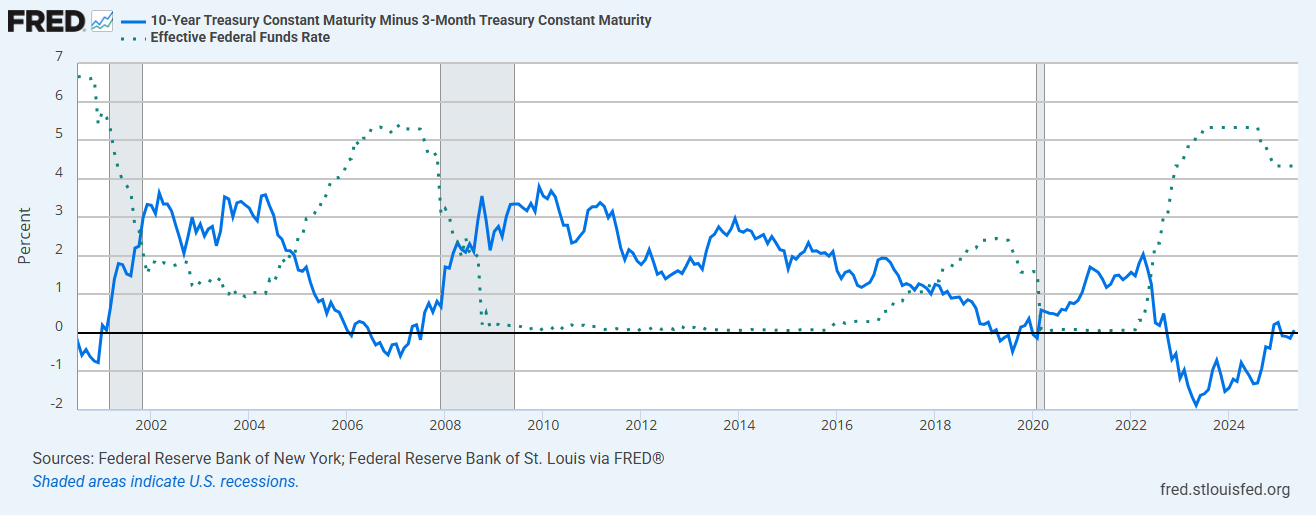
Term premium, represented by the solid blue line, behaves as expected. It exhibits an inverse relationship with short-term rates, which are represented by the dotted line. We can observe that term premium is historically at its lowest when short-term rates are at their highest, typically before the occurrence of a recession. During a recession, as rates fall, term premium appears to rise proportionally. Finally, after a recession, when short-term rates are at their lowest, term premium is historically at its highest.
The fact that the value of treasuries increases as short-term rates fall during a recession makes them a good hedge against economic downturns. Consequently, during times of increasing recession likelihood, a recession premium is introduced into yield—which, unlike term premium, subtracts from yield—due to investors being willing to pay extra for the increased upside potential.
The three yield components discussed so far—TVM, term premium, and recession premium—are considered to be the major ones. However, in order to obtain a complete understanding of yield, let’s ensure we don’t miss any of its influencing factors.
If there are high inflation expectations, does there exist an inflation premium that causes yields to increase? In normal market conditions, a separate inflation premium is not considered because the forward curve, which is captured in the term premium, already incorporates inflation expectations. However, in the case that the Fed signals it will not cut rates despite high inflation, we may see an independent inflation premium emerge that adequately compensates investors for the depreciation of the US dollar. In such a scenario, though we would see term premium decrease due to a flattening of the forward curve, high yields would persist due to an inflation premium that has separated from term premium.
Longer maturity treasuries are traded less frequently than shorter maturity treasuries, making them less liquid. This means investors may find it harder to sell their assets at favorable prices due to larger bid-ask spreads and higher volatility. As compensation, a liquidity premium is added into yield, increasing for longer maturities.
Credit-risk premium is compensation for the possibility of default. Usually, it is only discussed in the context of corporate bonds, or bonds for third-world countries. However, given the worsening financial position and rising debt burden of the US, the slim but increasing possiblity of the country defaulting, as evidenced by the recent Moody’s downgrade, could begin introducing a credit-risk premium.
Like any traded asset, treasuries are beholden to the fundamental supply-and-demand dynamics of the market. In fact, all of the aforementioned premiums can be considered simply as increases or decreases in treasury demand due to specific reasons. Term premium, for example, can be considered as the decrease in demand for longer maturity treasuries due to interest rate risk. Likewise, recession premium can be considered as the increase in demand due to a rising probability of recession. Through this lens, an arbitrary amount of other premiums—reasons for an increase or decrease in demand—can be hypothesized, especially given the large number of players in this market. It’s a dynamic that makes the bond market simultaneously simple yet complex.
For example, the increase in volatility caused by Trump’s “Liberation Day” tariff announcements led to a decrease in treasury demand due to highly leveraged basis trades needing to deleverage to meet increased collateral requirements. Though it is not one of the standard types of premiums that is usually discussed, there is clearly a volatility premium that arises as a consequence of supply-and-demand dynamics.
On the flip side, the issuance of a larger than usual amount of treasuries can cause yields to rise due to increased supply. This can occur when the US goverment, who finances its deficit spending via treasuries, does an even worse job at managing its budget than usual.
Par Yield Curve
So far, we have plotted the yield curve for zero-coupon treasuries (the zero curve), and the yield curve for expected future rates (the forward curve), but we have yet to plot the yield curve for actual coupon bearing treasuries proper. Let’s do that now.
If two treasuries have the same maturity but different coupon rates, they will have different YTMs—assuming they are fairly priced. This is called the coupon effect and occurs because the two will have different coupon amounts that, when reinvested, will each produce varying returns. Since an efficient market ensures that both treasuries will have an equal total return, in order to compensate for their varying coupons, their yields must be different.
Note: Ironically, the coupon effect implies that two treasuries with different coupon rates and equal maturities will have different durations (sensitivities to interest rate changes).
In order to mitigate distortions caused by the coupon effect, the curve is constructed using treasuries at par. A par treasury is one whose par value is equal to price. Since this occurs when its coupon rate is equal to its YTM, this reduces worries of coupon rate variation.
Treasuries issued in the most recent auction (on-the-run treasuries) are more ideal for par curve construction than treasuries issued in older auctions (off-the-run treasuries). This is because they trade closest to par, have increased liquidity, and have more accurate pricing.
Though we could collect our own market data for on-the-run treasuries to construct a par yield curve, let’s avoid the hassle this time by just using official data released by the US Treasury. Here’s a plot of their curve for May 21, 2025:
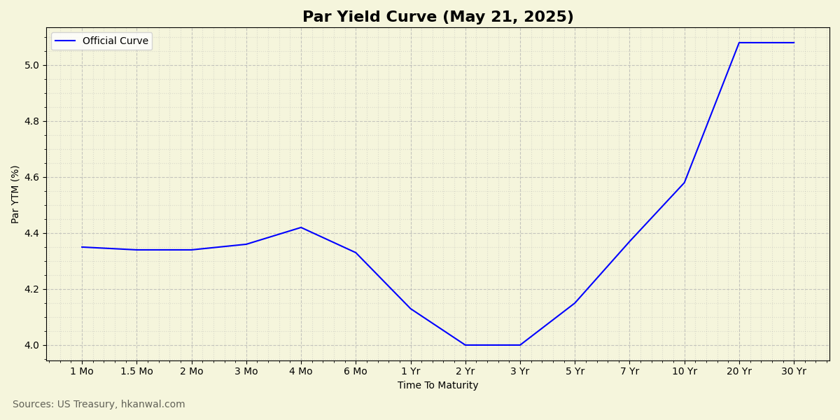
The shape of a par yield curve can tell us a lot about the market’s economic outlook. There are three common shapes: positive (upwards sloping), flat, or inverted (downwards sloping). Let’s discuss when, and why, each shape tends to occur.
A curve with a sharp upwards slope tends to occur during periods of high inflation. It reflects market expectations of rapid rate hikes.
A curve with a gradual upwards slope tends to occur in normal market conditions. This shape is characteristic of moderate inflation and a growing economy. These periods usually coincide with low interest rates that fuel growth. A high term premium and low recession premium contribute to the curve’s upwards sloping shape as investors move out of duration.
A flat curve is only seen during periods of transition between positively sloping and negatively sloping curves—in either direction.
An inverted curve tends to occur in advance of recessions. This shape is characteristic of low inflation and an economic slowdown. These periods usually coincide with high interest rates that cool the economy. A low term premium and high recession premium contribute to the curve’s downwards sloping shape as investors move into duration.
Given the common shapes the yield curve can take, and their corresponding economic implications, here’s a question for the reader: what does the shape of the May 21st par yield curve look like, and what does it mean for the economy?
The curve looks inverted, and is in the process of uninverting, having already bear steepened from deeper inversions seen in 2023 and 2024. This inversion corresponds to the current period of high interest rates and a slowing economy—as evidenced by the most recent negative GDP print in Q1 of 2025.
Note: Though indicative of economic slowdown, periods of yield curve inversion do not necessarily feature an underperforming equities market. Take the 2024 bull run as an example.
According to past data, the yield curve’s inverted shape signifies that the economy could soon be facing a recession. With regards to timing, historically, the recession tends to occur after the yield curve bear steepens from an inverted shape to a positive shape, so there is still time—typically ranging from a few months to a couple of years—to position accordingly.
Here is the historical data that was referenced:
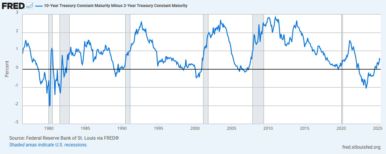
Periods when the blue line is negative correspond to an inverted yield curve, and areas shaded grey correspond to US recessions. Notably, uninversions have always been followed by recessions.
Conclusion
The recent rise in yields on the long end of the curve that has the media ringing alarm bells seems to have been caused by a mix of: market expectations of high inflation in the medium-term, increased bond market volatility, and fears of increased treasury supply due to projections of deeper government deficits. How concerned should we be? Though yields are trending upwards, a “bond market collapse” is unlikely and probably sensationalist. What’s more likely is a recession on the horizon, as suggested by macro-economic data.
In this article, we have covered treasury basics, yield basics, factors that influence treasury markets, and yield curve patterns. I hope that I have provided the reader with a sufficient foundation of knowledge—alongside reliable primary sources of yield data—atop which objective and independent evaluations of the bond market, unreliant on the opinions of others or the media, can be made with confidence.
Sources
The Name’s Bond
- https://www.investopedia.com/terms/b/bond.asp
- https://www.fidelity.com/fixed-income-bonds/individual-bonds/us-treasury-bonds
What’s The Deal With Yield?
- https://www.investopedia.com/terms/b/bond-valuation.asp
- https://www.investopedia.com/terms/y/yieldtomaturity.asp
- https://www.investopedia.com/terms/y/yield.asp
Zero Curve
- https://www.investopedia.com/terms/t/treasurystrips.asp
- https://www.investopedia.com/terms/s/spot_rate_yield_curve.asp
- https://www.interactivebrokers.com/campus/trading-lessons/the-bond-scanner-layout/
- https://www.federalreserve.gov/data/yield-curve-tables/feds200628_1.html
Forward Curve And Federal Reserve
- https://en.wikipedia.org/wiki/Forward_rate
- https://www.investopedia.com/terms/f/forwardrate.asp
- https://www.chicagofed.org/research/dual-mandate/dual-mandate
Yield Curve Shifts
Components Of Yield
- https://www.frbsf.org/research-and-insights/publications/economic-letter/2007/07/term-premium/
- https://youtu.be/jii8pg2DUa0?si=WSHJmHg21ej7Pedu
- https://fred.stlouisfed.org/series/T10Y3M
- https://horizon65.com/en/faq/inflation/what-is-an-inflation-premium/
- https://www.moonfare.com/glossary/liquidity-premium
- https://www.investopedia.com/terms/d/defaultrisk.asp
- https://www.youtube.com/watch?v=Ejc1PgbL3lQ
- https://www.investopedia.com/terms/d/deleverage.asp
Par Yield Curve
- http://investopedia.com/terms/p/par-yield-curve.asp
- https://quant.stackexchange.com/questions/59838/why-does-the-coupon-effect-mean-that-higher-yields-do-not-necessarily-mean-that
- https://home.treasury.gov/resource-center/data-chart-center/interest-rates/TextView?type=daily_treasury_yield_curve&field_tdr_date_value_month=202211%C2%A0
- https://www.schwab.com/learn/story/what-is-treasury-yield-curve
- https://newyorkclass.org/shape-u-s-treasury-yield-curve/
- https://fred.stlouisfed.org/series/T10Y2Y